1.Project Overview
PAYCO is a fully regulated Swiss financial intermediary that uses blockchain technology, artificial intelligence, and stable cryptocurrencies to revolutionize the way businesses handle payments. The platform complies with FINMA and is supervised by VQF. All digital assets are held in non-custodial wallets — only the customer ever has access to their funds.
The product covers three core payment services:
Remittance — fast, direct international payments
Escrow — payment-on-delivery protection between unfamiliar parties
Letters of Credit — UCP600-compliant trade finance for importers and exporters
I was tasked with designing the full mobile app UX — from information architecture through to high-fidelity UI screens — translating PAYCO's complex, regulated financial services into a clean, intuitive, and trustworthy mobile experience.
1/10
Transaction time vs traditional
1/3
Transaction cost vs traditional
10 min
Paperwork (AI-powered)
2.The Problem
Businesses that operate across borders face a fundamentally broken payment system. Wire transfers are slow and expensive. Traditional Letters of Credit require weeks of bank paperwork. Paying a supplier you've never met carries enormous risk — there's no protection if goods aren't delivered or work isn't completed.
Slow & Expensive Remittances
International wire transfers take 3–5 days and consume 5–10% of the transaction value in fees.
Complex Letters of Credit
Traditional LCs require physical paperwork, bank intermediaries, and can take weeks — pricing out small businesses entirely.
No Trust in New Relationships
When two businesses transact for the first time, one party always carries the full risk. This prevents deals, especially cross-border.
KYC Friction Kills Onboarding
Regulated fintech apps require extensive identity verification, but badly designed KYC flows are the #1 reason users abandon signup.
3.The Goal
Design a mobile app that makes PAYCO's regulated, blockchain-powered payment services feel as simple and trustworthy as sending a message — without sacrificing the compliance and security that Swiss regulations demand.
Design Goals
Any payment type initiated in under 3 minutes
KYC/KYB onboarding feels guided, not bureaucratic
Escrow and Letters of Credit understandable to non-finance users
Every touchpoint communicates trust, security, and regulatory legitimacy
AI document processing feels instant — not manual
"How Might We" Questions
"How might we make a Letter of Credit feel as simple as filling out an online form?"
"How might we reassure users their funds are safe in a blockchain wallet?"
"How might we design compliance flows that feel like customer care, not interrogation?"
"How might we communicate Swiss regulation without overwhelming users with legal language?"
4.User Personas
Primary Persona
Beshoy
CEO, 35, America
Imports products from overseas suppliers and makes large payments to businesses he's never met. He's been burned before — paid upfront, goods never arrived.
Goals
+
Pay internationally without excessive fees
+
Legal protection if goods aren't delivered
+
One-time compliance setup
Frustrations
-
Banks take days and charge enormous fees
-
Traditional escrow is paper-heavy
-
Letters of Credit require a lawyer
Secondary Persona
Tawfik
Designer, 25, Egypt
Delivers creative work to international clients and wants money held in escrow before he starts — so he knows he'll be paid when he delivers.
Goals
+
Receive international payments without losing money to fees
+
Start work only after funds are confirmed
+
Simple mobile-first experience
Frustrations
-
PayPal freezes accounts
-
No protection against disappearing clients
-
Crypto wallets feel risky without technical knowledge
5.User Journey Mapping
I mapped the full end-to-end experience across 6 phases — from first hearing about PAYCO to recommending it to others. This revealed where anxiety peaks, where drop-off risk is highest, and where design has the biggest opportunity to build confidence.
Phase 1
Research
Compare apps, check fees, verify regulatory credentials.
PAIN
Skepticism about new blockchain fintech
FIX
Lead with FINMA/VQF badges as trust signals from screen one
Phase 2
Sign Up
Download, create account, choose Personal vs Business.
PAIN
Confusion about which account type fits
FIX
Plain-language account type selector with one-line descriptions
Phase 3
KYC / KYB Onboarding
Personal info, nationality, address, OTP, ID scan, business docs.
PAIN
Multi-step compliance feels like a wall
FIX
Progress bar on every screen, reassuring micro-copy, success animation on completion
Phase 4
Making a Payment
Choose Remittance / Escrow / LC → enter details → confirm.
PAIN
Unfamiliarity with escrow and LC mechanics
FIX
Plain-language explainers and "How does this work?" tooltips before committing
Phase 5
Monitoring the Transaction
Track status, approve milestones, release funds, get notifications.
PAIN
Anxiety while funds are held
FIX
Real-time status updates, visual transaction timeline, clear milestone release button
Phase 6
Feedback & Referral
Rate experience, refer other businesses, check rewards.
PAIN
No natural prompt to refer
FIX
Post-transaction referral prompt with incentive, achievement badges
6.Information Architecture
Before designing a single screen, I mapped the complete app structure. With three distinct payment products and a full compliance layer, the IA had to be deep enough for complexity — but shallow enough that no user ever feels lost. Everything sits a maximum of 3 levels deep — reachable in 3 taps.
Dashboard
Account Summary
Analytics
Goals & Rewards
Accounts
Checking
Savings
Credit Cards
Transactions
All Transactions
Income
Expenses
Budgeting
Budget Overview
Categories
Spending Analysis
Investments
Portfolio
Stocks
Mutual Funds
Key IA Decision: I surfaced the three core payment products (Remittance, Escrow, Letters of Credit) as primary CTAs on the home screen — always visible — because initiating a payment is the #1 job to be done for PAYCO's business users.
7.Compliance Flows (KYC / KYB / EDD)
PAYCO is a fully regulated Swiss financial intermediary. Every user must complete identity verification — a legal requirement. My challenge was making this necessary friction feel as light and reassuring as possible.
KYC — Know Your Customer (12 Steps)
1. Splash
2. Account Type
3. Personal Info
4. Nationality
5. Terms & Conditions
6. Address
7. Phone Verify
8. OTP Code
9. Email Verify
10. Email OTP
11. ID Scan
12. Success!
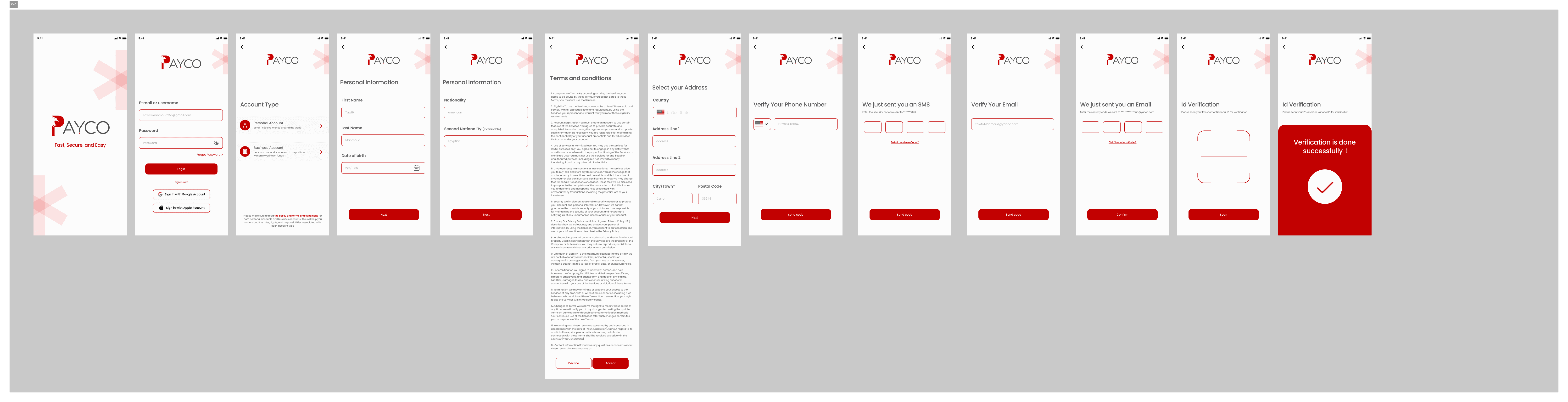
KYC Flow — 12 Steps from Splash to Verification Success
Key Copy Decisions:
"We're legally required to verify your identity — it only takes about 2 minutes"
"Your document is encrypted and never stored on our servers"
"Step 3 of 12" visible on every screen
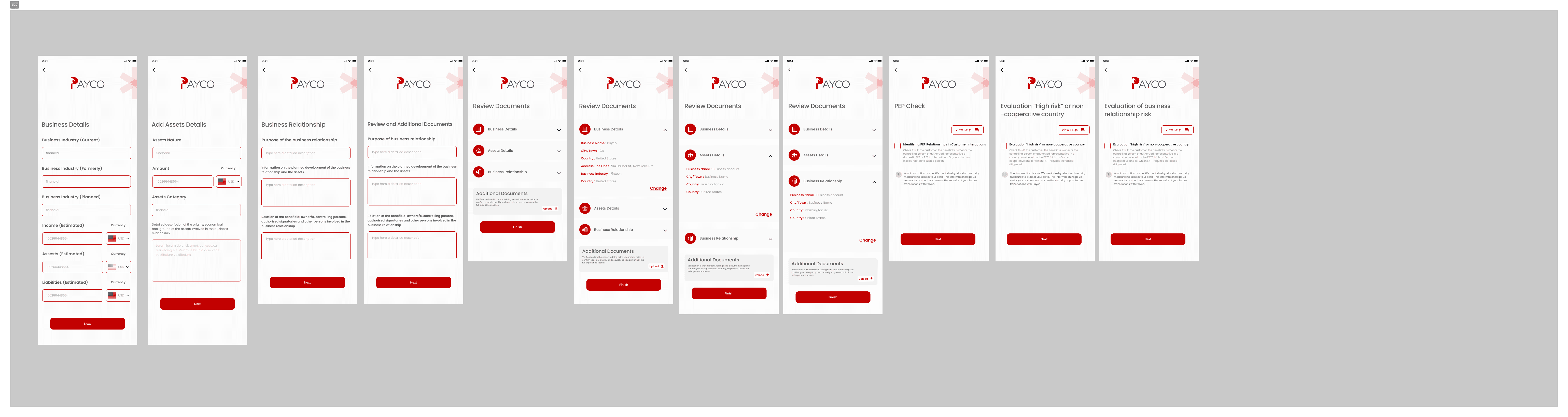
KYB — Know Your Business
Additional layer after KYC: company name, registration number, business type, beneficial owners, document upload, manual review confirmation ("Usually takes 24 hours").

KYB Flow — Business Verification for Company Accounts
EDD — Enhanced Due Diligence
For users flagged as high-risk: source-of-funds declaration, supplementary document uploads, manual review.
EDD Flow — Enhanced Due Diligence for High-Risk Profiles
8.UI Design: Core Screens
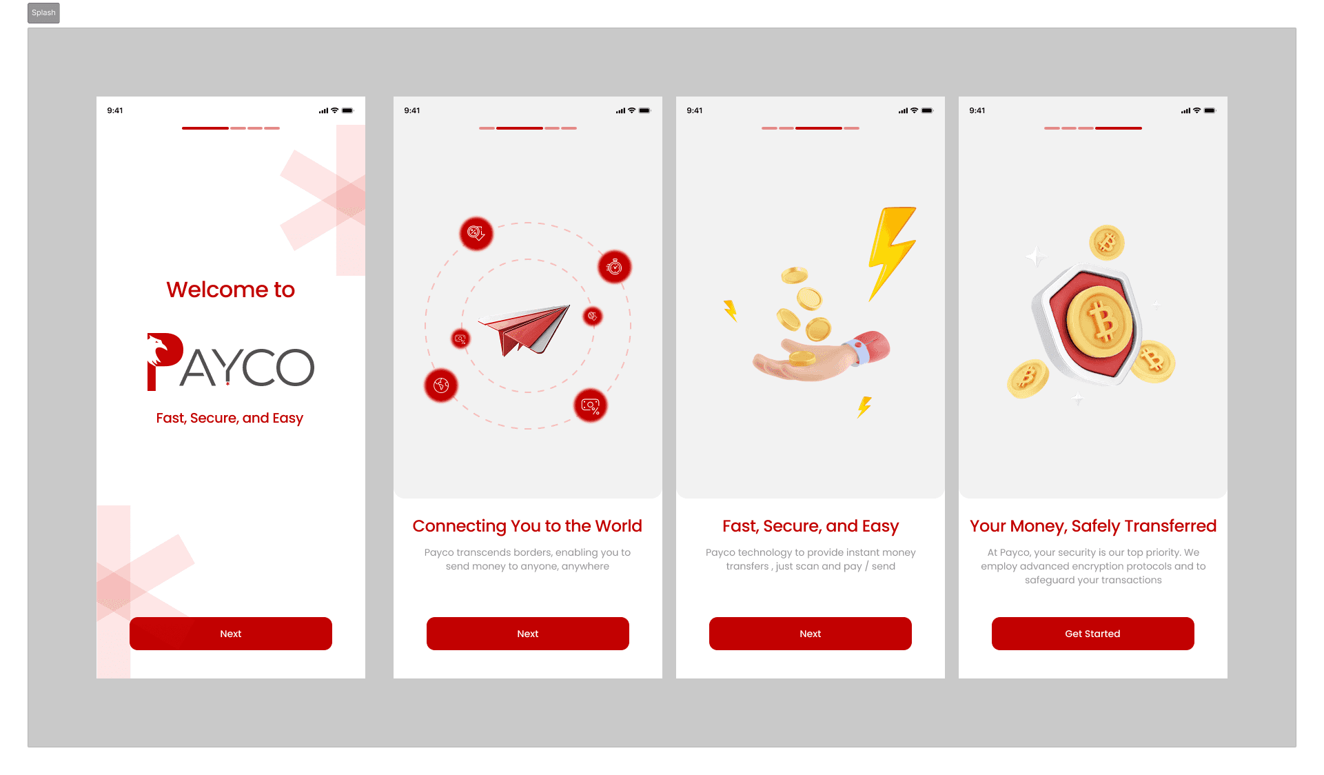
With structure and flows mapped, I moved into high-fidelity UI. The visual language — bold red on near-black — communicates security, premium quality, and seriousness. Every screen was designed for iOS, optimized for one-handed use, and anchored around three primary payment actions.
Splash & Onboarding — Clean, Confident First Impression

Home Screen, Wallet, Profile & Share — Core Navigation Hub

Escrow Creation, Notifications & Payment Request Flows
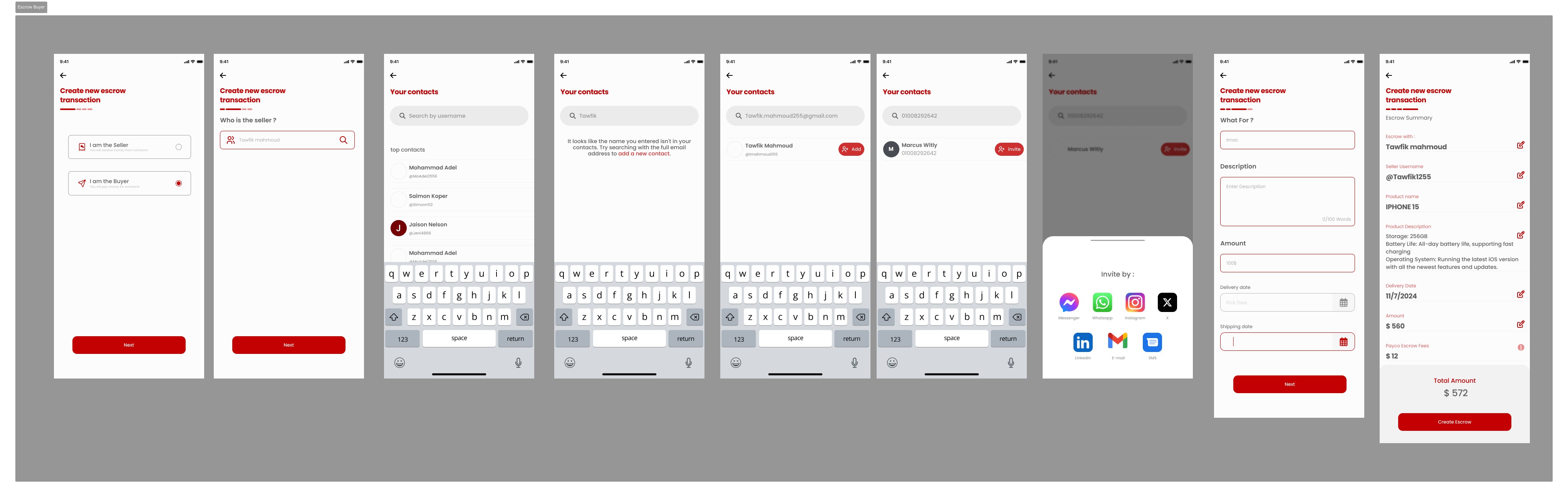
Escrow Buyer Flow — 8-Step Guided Transaction Creation
Letters of Credit & Extended Payment Flows
9.Design Decisions & Rationale
Swiss Regulation as a Design Feature
FINMA and VQF logos appear on splash, onboarding, and profile — not buried in a footer. In a world of unregulated crypto apps, Swiss backing is PAYCO's strongest trust signal. I treated it as a feature.
Dark UI = Security
Near-black (#0D0D0D) with PAYCO red (#C0392B). Premium fintech apps use dark UIs because users associate them with professionalism and protection. For an app handling large business transactions, a casual UI is a liability.
QR-First Transfers
QR scanning as the primary transfer method eliminates all manual address input — the #1 source of errors in crypto. Sending money becomes as easy as scanning a code.
Escrow on the Home Screen
Most apps bury escrow in sub-menus. For PAYCO's business users, escrow is the most valuable differentiator. "Create Escrow" is a primary CTA — always one tap away.
Plain Language Over Legal Copy
PAYCO operates in a jargon-heavy space: KYC, AML, EDD, UCP600, non-custodial wallets. None of it appears without a human explanation. Every compliance screen uses reassuring, plain language — because the goal is to make users feel protected, not processed.
AI Processing Made Visible
A processing animation with "Our AI is reviewing your document — usually under 30 seconds" makes the technology feel like it's working for the user, not making them wait.
10.Key Outcomes
PAYCO's brand promise — 1/10 the time, 1/3 the cost, 10 minutes of paperwork — became my design benchmark.
Remittance initiated in under 3 taps (QR scan eliminates manual input)
KYC completable in ~10 minutes — matching the brand's paperwork promise
12-step KYC with visible progress on every screen — reducing abandonment risk
Escrow flow understandable without prior knowledge — 8-step plain-language guided flow
All 3 payment products surfaced on home screen — zero sub-navigation to initiate
Full compliance coverage: KYC + KYB + EDD fully designed and documented
30+ features organized into a 3-level IA — nothing more than 3 taps away
11.Reflection & Learnings
Designing for a regulated Swiss fintech was one of the most demanding — and most rewarding — UX challenges I've taken on. Every decision had a legal dimension. Every screen had to balance regulatory necessity with human warmth.
What I'm most proud of:
Translating Letters of Credit — a 100-year-old trade finance instrument — into a mobile flow a first-time user can complete in under 10 minutes.
Three Things I'd Do Differently
1
Conduct moderated usability testing on the LC flow — most users have never heard of Letters of Credit
2
Design all error states — ID rejected, OTP expired, document unclear — not just happy paths
3
Start the Android version in parallel — Material Design adaptations should happen early
What I learned: Compliance and good UX are not opposites. A progress bar, a reassuring sentence, and a success animation communicates "we take your security seriously" far better than a wall of legal text ever could.
12.Next Steps
Usability Testing
5 moderated sessions with importers, exporters, and freelancers
Accessibility Audit
WCAG AA compliance on all dark-background screens
Error & Edge Case Design
ID not recognized, OTP expired, escrow disputed
Empty State Design
No transactions yet, wallet at zero, no contacts added
Android Adaptation
Material Design 3 version of all screens
Notification Design
Push notification copy for every transaction event
Micro-interaction Spec
Loading states, transitions, success animations for dev handoff
About PAYCO
"Payco is a digital solution for cross-border payments, providing secure and convenient services for individuals and businesses. With Payco, you can easily send money internationally, issue letters of credit, and conduct transactions using our secure digital wallet."
"We are a fully regulated Swiss financial intermediary (VQF SRO member), and we comply with all the Swiss regulations regarding the financial intermediary license limits."
Technology
Artificial Intelligence
Blockchain Technology
Stable Cryptocurrencies
Regulated by
FINMA
VQF
UX Case Study
PAYCO
Blockchain-Powered Business Payment App
"Make Faster, Cheaper and More Secure Business Payments on the Blockchain"
Role
Product / UI UX Designer (Solo)
Platform
iOS Mobile App
Tools
Figma
Industry
Fintech / Blockchain / B2B Payments
Regulated by
FINMA + VQF (Swiss Regulated Finance)
Design System
Typography

Spacing

Color shades

1.Project Overview
PAYCO is a fully regulated Swiss financial intermediary that uses blockchain technology, artificial intelligence, and stable cryptocurrencies to revolutionize the way businesses handle payments. The platform complies with FINMA and is supervised by VQF. All digital assets are held in non-custodial wallets — only the customer ever has access to their funds.
The product covers three core payment services:
Remittance — fast, direct international payments
Escrow — payment-on-delivery protection between unfamiliar parties
Letters of Credit — UCP600-compliant trade finance for importers and exporters
I was tasked with designing the full mobile app UX — from information architecture through to high-fidelity UI screens — translating PAYCO's complex, regulated financial services into a clean, intuitive, and trustworthy mobile experience.
1/10
Transaction time vs traditional
1/3
Transaction cost vs traditional
10 min
Paperwork (AI-powered)
2.The Problem
Businesses that operate across borders face a fundamentally broken payment system. Wire transfers are slow and expensive. Traditional Letters of Credit require weeks of bank paperwork. Paying a supplier you've never met carries enormous risk — there's no protection if goods aren't delivered or work isn't completed.
Slow & Expensive Remittances
International wire transfers take 3–5 days and consume 5–10% of the transaction value in fees.
Complex Letters of Credit
Traditional LCs require physical paperwork, bank intermediaries, and can take weeks — pricing out small businesses entirely.
No Trust in New Relationships
When two businesses transact for the first time, one party always carries the full risk. This prevents deals, especially cross-border.
KYC Friction Kills Onboarding
Regulated fintech apps require extensive identity verification, but badly designed KYC flows are the #1 reason users abandon signup.
3.The Goal
Design a mobile app that makes PAYCO's regulated, blockchain-powered payment services feel as simple and trustworthy as sending a message — without sacrificing the compliance and security that Swiss regulations demand.
Design Goals
Any payment type initiated in under 3 minutes
KYC/KYB onboarding feels guided, not bureaucratic
Escrow and Letters of Credit understandable to non-finance users
Every touchpoint communicates trust, security, and regulatory legitimacy
AI document processing feels instant — not manual
"How Might We" Questions
"How might we make a Letter of Credit feel as simple as filling out an online form?"
"How might we reassure users their funds are safe in a blockchain wallet?"
"How might we design compliance flows that feel like customer care, not interrogation?"
"How might we communicate Swiss regulation without overwhelming users with legal language?"
4.User Personas
Primary Persona
Beshoy
CEO, 35, America
Imports products from overseas suppliers and makes large payments to businesses he's never met. He's been burned before — paid upfront, goods never arrived.
Goals
+
Pay internationally without excessive fees
+
Legal protection if goods aren't delivered
+
One-time compliance setup
Frustrations
-
Banks take days and charge enormous fees
-
Traditional escrow is paper-heavy
-
Letters of Credit require a lawyer
Secondary Persona
Tawfik
Designer, 25, Egypt
Delivers creative work to international clients and wants money held in escrow before he starts — so he knows he'll be paid when he delivers.
Goals
+
Receive international payments without losing money to fees
+
Start work only after funds are confirmed
+
Simple mobile-first experience
Frustrations
-
PayPal freezes accounts
-
No protection against disappearing clients
-
Crypto wallets feel risky without technical knowledge
5.User Journey Mapping
I mapped the full end-to-end experience across 6 phases — from first hearing about PAYCO to recommending it to others. This revealed where anxiety peaks, where drop-off risk is highest, and where design has the biggest opportunity to build confidence.
Phase 1
Research
Compare apps, check fees, verify regulatory credentials.
PAIN
Skepticism about new blockchain fintech
FIX
Lead with FINMA/VQF badges as trust signals from screen one
Phase 2
Sign Up
Download, create account, choose Personal vs Business.
PAIN
Confusion about which account type fits
FIX
Plain-language account type selector with one-line descriptions
Phase 3
KYC / KYB Onboarding
Personal info, nationality, address, OTP, ID scan, business docs.
PAIN
Multi-step compliance feels like a wall
FIX
Progress bar on every screen, reassuring micro-copy, success animation on completion
Phase 4
Making a Payment
Choose Remittance / Escrow / LC → enter details → confirm.
PAIN
Unfamiliarity with escrow and LC mechanics
FIX
Plain-language explainers and "How does this work?" tooltips before committing
Phase 5
Monitoring the Transaction
Track status, approve milestones, release funds, get notifications.
PAIN
Anxiety while funds are held
FIX
Real-time status updates, visual transaction timeline, clear milestone release button
Phase 6
Feedback & Referral
Rate experience, refer other businesses, check rewards.
PAIN
No natural prompt to refer
FIX
Post-transaction referral prompt with incentive, achievement badges
6.Information Architecture
Before designing a single screen, I mapped the complete app structure. With three distinct payment products and a full compliance layer, the IA had to be deep enough for complexity — but shallow enough that no user ever feels lost. Everything sits a maximum of 3 levels deep — reachable in 3 taps.
Dashboard
Account Summary
Analytics
Goals & Rewards
Accounts
Checking
Savings
Credit Cards
Transactions
All Transactions
Income
Expenses
Budgeting
Budget Overview
Categories
Spending Analysis
Investments
Portfolio
Stocks
Mutual Funds
Key IA Decision: I surfaced the three core payment products (Remittance, Escrow, Letters of Credit) as primary CTAs on the home screen — always visible — because initiating a payment is the #1 job to be done for PAYCO's business users.
7.Compliance Flows (KYC / KYB / EDD)
PAYCO is a fully regulated Swiss financial intermediary. Every user must complete identity verification — a legal requirement. My challenge was making this necessary friction feel as light and reassuring as possible.
KYC — Know Your Customer (12 Steps)
1. Splash
2. Account Type
3. Personal Info
4. Nationality
5. Terms & Conditions
6. Address
7. Phone Verify
8. OTP Code
9. Email Verify
10. Email OTP
11. ID Scan
12. Success!
KYC Flow — 12 Steps from Splash to Verification Success
Key Copy Decisions:
"We're legally required to verify your identity — it only takes about 2 minutes"
"Your document is encrypted and never stored on our servers"
"Step 3 of 12" visible on every screen
KYB — Know Your Business
Additional layer after KYC: company name, registration number, business type, beneficial owners, document upload, manual review confirmation ("Usually takes 24 hours").
KYB Flow — Business Verification for Company Accounts
EDD — Enhanced Due Diligence
For users flagged as high-risk: source-of-funds declaration, supplementary document uploads, manual review.
EDD Flow — Enhanced Due Diligence for High-Risk Profiles
8.UI Design: Core Screens
With structure and flows mapped, I moved into high-fidelity UI. The visual language — bold red on near-black — communicates security, premium quality, and seriousness. Every screen was designed for iOS, optimized for one-handed use, and anchored around three primary payment actions.
Splash & Onboarding — Clean, Confident First Impression
Home Screen, Wallet, Profile & Share — Core Navigation Hub
Escrow Creation, Notifications & Payment Request Flows
Escrow Buyer Flow — 8-Step Guided Transaction Creation
Letters of Credit & Extended Payment Flows
9.Design Decisions & Rationale
Swiss Regulation as a Design Feature
FINMA and VQF logos appear on splash, onboarding, and profile — not buried in a footer. In a world of unregulated crypto apps, Swiss backing is PAYCO's strongest trust signal. I treated it as a feature.
Dark UI = Security
Near-black (#0D0D0D) with PAYCO red (#C0392B). Premium fintech apps use dark UIs because users associate them with professionalism and protection. For an app handling large business transactions, a casual UI is a liability.
QR-First Transfers
QR scanning as the primary transfer method eliminates all manual address input — the #1 source of errors in crypto. Sending money becomes as easy as scanning a code.
Escrow on the Home Screen
Most apps bury escrow in sub-menus. For PAYCO's business users, escrow is the most valuable differentiator. "Create Escrow" is a primary CTA — always one tap away.
Plain Language Over Legal Copy
PAYCO operates in a jargon-heavy space: KYC, AML, EDD, UCP600, non-custodial wallets. None of it appears without a human explanation. Every compliance screen uses reassuring, plain language — because the goal is to make users feel protected, not processed.
AI Processing Made Visible
A processing animation with "Our AI is reviewing your document — usually under 30 seconds" makes the technology feel like it's working for the user, not making them wait.
10.Key Outcomes
PAYCO's brand promise — 1/10 the time, 1/3 the cost, 10 minutes of paperwork — became my design benchmark.
Remittance initiated in under 3 taps (QR scan eliminates manual input)
KYC completable in ~10 minutes — matching the brand's paperwork promise
12-step KYC with visible progress on every screen — reducing abandonment risk
Escrow flow understandable without prior knowledge — 8-step plain-language guided flow
All 3 payment products surfaced on home screen — zero sub-navigation to initiate
Full compliance coverage: KYC + KYB + EDD fully designed and documented
30+ features organized into a 3-level IA — nothing more than 3 taps away
11.Reflection & Learnings
Designing for a regulated Swiss fintech was one of the most demanding — and most rewarding — UX challenges I've taken on. Every decision had a legal dimension. Every screen had to balance regulatory necessity with human warmth.
What I'm most proud of:
Translating Letters of Credit — a 100-year-old trade finance instrument — into a mobile flow a first-time user can complete in under 10 minutes.
Three Things I'd Do Differently
1
Conduct moderated usability testing on the LC flow — most users have never heard of Letters of Credit
2
Design all error states — ID rejected, OTP expired, document unclear — not just happy paths
3
Start the Android version in parallel — Material Design adaptations should happen early
What I learned: Compliance and good UX are not opposites. A progress bar, a reassuring sentence, and a success animation communicates "we take your security seriously" far better than a wall of legal text ever could.
12.Next Steps
Usability Testing
5 moderated sessions with importers, exporters, and freelancers
Accessibility Audit
WCAG AA compliance on all dark-background screens
Error & Edge Case Design
ID not recognized, OTP expired, escrow disputed
Empty State Design
No transactions yet, wallet at zero, no contacts added
Android Adaptation
Material Design 3 version of all screens
Notification Design
Push notification copy for every transaction event
Micro-interaction Spec
Loading states, transitions, success animations for dev handoff
About PAYCO
"Payco is a digital solution for cross-border payments, providing secure and convenient services for individuals and businesses. With Payco, you can easily send money internationally, issue letters of credit, and conduct transactions using our secure digital wallet."
"We are a fully regulated Swiss financial intermediary (VQF SRO member), and we comply with all the Swiss regulations regarding the financial intermediary license limits."
Technology
Artificial Intelligence
Blockchain Technology
Stable Cryptocurrencies
Regulated by
FINMA
VQF
UX Case Study
PAYCO
Blockchain-Powered Business Payment App
"Make Faster, Cheaper and More Secure Business Payments on the Blockchain"
Role
Product / UI UX Designer (Solo)
Platform
iOS Mobile App
Tools
Figma
Industry
Fintech / Blockchain / B2B Payments
Regulated by
FINMA + VQF (Swiss Regulated Finance)